JSC community reacts to “Do North” brand
Last month, an email sent out to all Johnson State College and Lyndon State College students, faculty and staff unveiled Northern Vermont University’s first official “Do North” brand with new designs, colors, phrases and fonts synthesizing aspects of both campuses.
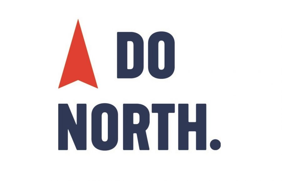
The viewbook’s bold white and red “Do North” slogan is centered over a topographical blue background and red compass needle pointed skyward, a theme running throughout its pages.
An accompanying “micro” website, consistent with themes from the viewbook, has also been live for several weeks with insights to both campuses’ students and activities.
Now that it has been over a month since JSC Web and Digital Communications Manager Melissa Weinstein and LSC Executive Director of Communications Sylvia Plumb announced the brand, some within the JSC community have had time to digest the campaign.
English and secondary education major Shane Wyman said the new brand represents an extension of his experience thus far at JSC.
“Faculty and staff at JSC, since my first day here, told me that they were there to help me get where I want to go,” said Wyman. “Now our college reflects that inside and out. It’s a good change that I think will show students even more that they aren’t just a number when they attend NVU.”
With the help of the Columbus, Ohio-based branding firm Ologie, Weinstein and Plumb say NVU’s “Do” in “Do North” brand highlights a “can-do approach to teaching and learning.” “North,” according to Ologie, identifies a “sense of purpose” for NVU’s students, faculty and staff.
Northern Vermont University President Elaine Collins was a member of the team that developed the “Do North” brand and slogan, and she is very positive about the results.
“It was a huge, long process,” she said. “Ologie’s job was to try and capture the personality of the institution. The characteristics they attributed to NVU were personal, focused, driven, adventurous — which I really like, because it takes someone with a spirit of adventure to live in northern Vermont — spirited, tireless, hardworking, approachable, inclusive and supportive.”
Ologie eventually came to the team with two different options, one of them being the current “Do North” brand that they decided on. “When we saw the brand, it was the fastest decision we made as a team in this entire process,” said Collins. “There was an emotional resonance to the messaging.”
Although everyone on the rebranding team had equal input, Collins had specific goals for how NVU should be presented going forward. “I wanted something that was bold and that stood out,” she said. “It was considered bold to go with this brand. Something red, not green for Vermont. If we’re going to be a university that says we’re innovative and creative, we needed a brand that matched.”
Collins says she adores the “Do North” brand and has received a resoundingly positive response regarding it. “I really like the use of red — it catches attention,” she said. “I love the topographical part, and the play on words with the spelling. I have gotten a sense from the reception [that] we got it right and we did Vermont right.”
For Database Manager of Alumni Relations Mary Fafard, the brand signals a new direction that could propel NVU beyond other colleges and universities.
“The marketing materials definitely set us apart from the other colleges in Vermont,” said Fafard. “We’ve moved away from the greens and the whites; there’s more blue and red. So I think that brand is going to be strong and stand apart from UVM or Castleton because they’re all green.”
The viewbook’s interior retains the light greens and blues of Lyndon and Johnson, respectively, while showcasing a nuanced and unified layout.
Having been a JSC employee and community member since 1988, Director of First-Year Experience Margo Warden has seen a multitude of changes to JSC’s brand, logo and even its mascot.
“First of all, ‘Do North’ — it just kind of gets your attention,” said Warden. “Then Northern Vermont University really places us in the compass. Looking inside this material and being able to see the connection between the two campuses.”
Brittney Malik, a JSC student who works in JSC’s print shop and Student Government Association (SGA), said the branding represents NVU’s focus on experiential learning and array of course options for current and prospective students.
“It represents both campuses and it draws your attention to what both campuses have to offer because in high school you want to experience a lot of things,” said Malik. “And each campus has great, individual aspects, but some of them aren’t offered at one campus. So it’s just representing that you have so many options now that it’s a university rather than individual campuses.”
Conversely, part-time public safety officer and special education major Siobhan Anderson said the new materials miss the mark for her.
“I wasn’t really sure about the brand ‘Do North.’ To me, that just doesn’t sound really professional in any way,” said Anderson. “‘Go North’ I feel like would’ve been – even that one-letter difference – a much more powerful [message]. Coming from the state of Georgia, seeing something that says ‘Go North’ would have really called to me, personally. ‘Do North’ I would think, ‘Okay?’”
And while she understands the need for the new marketing campaign, Anderson said that it has made her time at JSC feel diminished in the attention that the soon-to-be university has been receiving over the past year.
A large role that the new materials will serve is in the recruitment of NVU’s first class for fall 2018. Wyman said that, thus far, the new brand is already making a positive difference.
“It absolutely will help with recruiting new students,” he said. “Working in the admissions office, I’ve seen prospective students already getting excited about the new NVU gear. It makes perfect sense to have started rebranding [for] NVU.”
To complement the earthy textures of the viewbook, the photography features overhead photos of forest and the Green Mountain spine surrounding both campuses.
Warden sees the brand, showcased on the microsite and in the viewbook, as capitalizing on northern Vermont’s best environmental and social qualities, providing viewers with a sense of place no matter where they live.
“Hopefully, it will reboot our image and how people perceive us in the state of Vermont, so I think it will help us there,” said Warden. “I think Vermont has a pretty good reputation in terms of social policies, environmental policies — there are some real positives that can be draws. One of the phrases is, ‘Above all else, a haven of higher learning.’ That, and everything else in this book, will attract people.”
Overall, Malik and Warden say that, while change can feel uncomfortable, time will ultimately normalize the new designs and colors for students into a more cohesive whole.
“I think the branding team and marketing team are doing a very good job of still trying to just give it to us in a way we’ll appreciate,” said Malik. “There may be a change of [opinion] and it’ll be good for us, and we just have to make our experience the best it can be.”